A big few weeks. New workspaces don't hit a checkout wall anymore. The composer got rebuilt for phones and learned some manners on desktop. And notifications now do the bookkeeping for you.
A composer built for your phone.
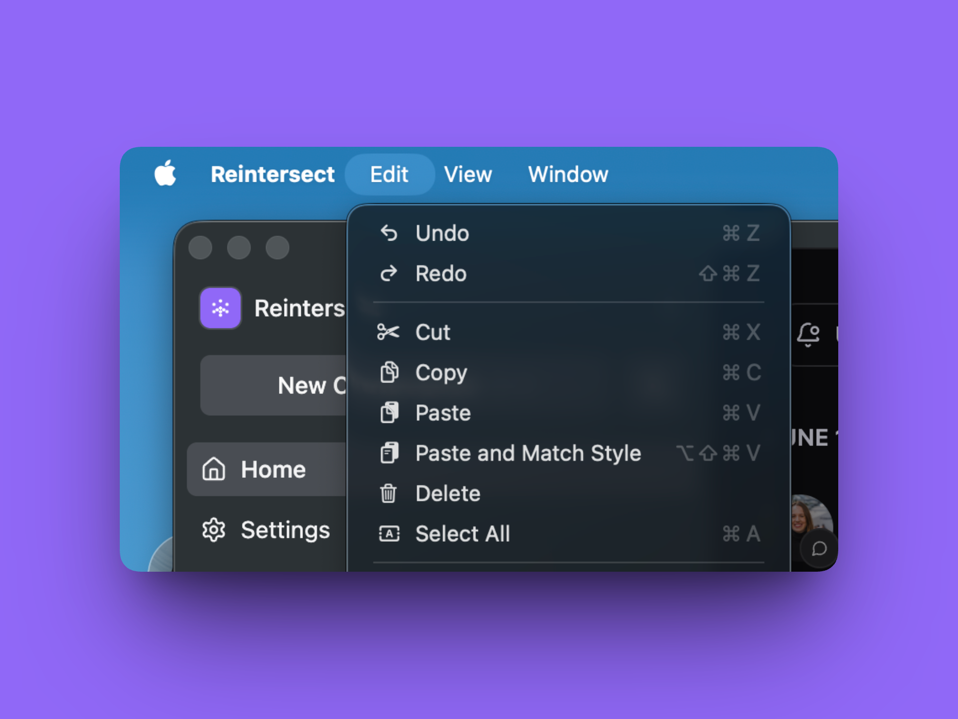
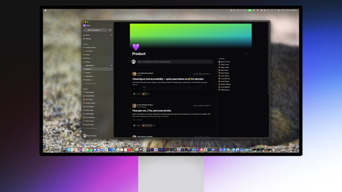
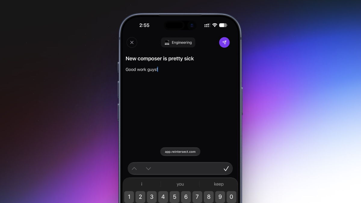
Writing a conversation on mobile used to mean fighting a drawer. The composer is now full-screen on phones, and it tracks your keyboard - the editor scrolls to stay above it instead of hiding behind it. Desktop gets a tighter dialog with an attach button and an emoji picker in the toolbar.
Notifications that read themselves.
Open a circle, and its notifications mark themselves read. Open a conversation, and the reply notifications for it do the same. No more clearing a bell full of things you've already seen.
Two more things in the same vein:
Joining a circle subscribes you to its conversations from the start - you no longer have to opt in to hear about the thing you just joined
Delivery got more stubborn. If a notification fails to send, we now retry instead of quietly dropping it
Invites that meet you where you are.
Invite links got smarter about who's clicking them. Already signed in with the right account? You go straight to joining the workspace - no second sign-in. Signed in with a different account? We say so, and offer Sign out and continue. Expired? You get told that, plainly, instead of a generic error.
And right after you create a workspace, a new ‘bring your team’ step lets you paste a pile of emails and invite everyone together.
Sign-in, with fewer dead ends.
The sign-in code screen now has a resend button with a short cooldown, and the inputs play nice with password managers
The email field no longer yells at you mid-keystroke - it checks when you submit, and says "Please enter a valid email address" like a person would instead of a cryptic message full of weird symbols.
Text that's easier on the eyes.
Conversations and replies got a typography pass: better line heights, more breathing room around headings, rounded blockquote bars, cleaner lists. DMs use a tighter variant that fits more conversation on screen. Long, formatted posts also render noticeably faster - we stopped doing a lot of unnecessary work for text that's just being read.
Reactions, unified.
Reaction chips on conversations, replies, and DMs are now one consistent component. They keep a stable order (first reaction stays first), animate out when removed, and the counts don't wiggle as they change.
Smaller frictions, removed.
The reaction picker no longer lingers on screen after you close it
Formatting and link menus stopped hiding behind the composer dialog
Opening a reply scrolls the editor into view instead of leaving it below the fold
The DM formatting toolbar no longer overflows on narrow screens - it scrolls
Editors load drafts reliably - focus and saved drafts no longer race each other on open
Invite buttons across the app now take you to the Invites page, where invites actually live